Simplify travel planning
and enjoy the vacation
The next trip is coming up and of course you want to make the most of it. What is there to see? Where is the best place to eat? Where did I put the ticket again? What if...?
It often requires a lot of planning and research to find the right things for yourself. And often at the expense of time during the vacation.
At the end of my training as a UX/UI designer, I developed "VoyaJoy". The app is designed to make travel planning much easier and bundle documents, notes etc. in one application.
Within four weeks, I conducted user research with surveys and interviews, processed the findings into a user flow, user journey map and personas and created wireframes based on this, which I used to design the final app.
Recognizing problems
I myself like to travel and research and plan activities or possible restaurant visits in advance to make the most of my time on site. I have often encountered problems that unnecessarily complicate the planning.
What bothered me the most was that I often had to use many different apps, such as for navigation, information gathering, or daily planning. Conversations with friends made it clear that many others have similar experiences and would like some simplification.
Develop a better understanding of the user
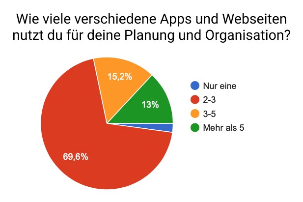
In order to better understand the potential user and their needs, I first conducted an anonymous survey in which I asked about aspects of travel behavior and planning. For example, it turned out that 56% spend several hours and 26% spend several days on planning their trip. In doing so, 70% of the respondents use two to three different apps for research – mostly Google, Instagram or travel blogs, or they ask friends and family for recommendations.
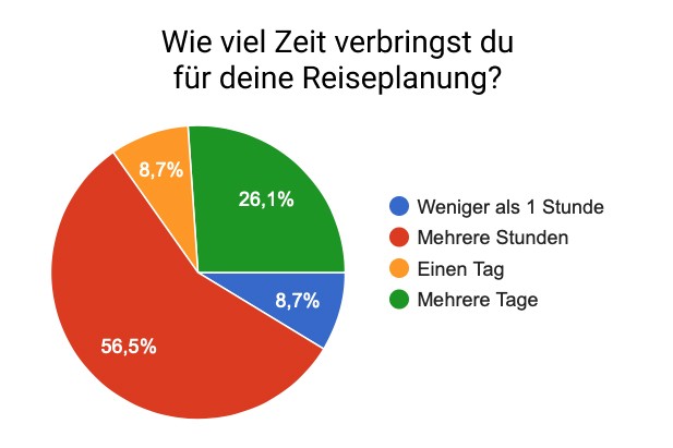
Some examples from the conducted survey
In personal interviews, the assumption that a lot of time is invested in research and planning was confirmed once again. It was irrelevant whether this was done before or during the trip
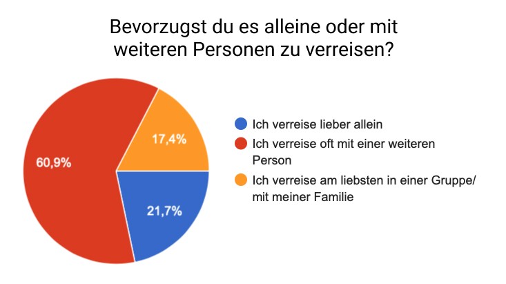
Another aspect was trip planning with friends or partners. 60% of the respondents travel with at least one other person and meet up in person with their fellow travelers to discuss further details. Here too, a lot of time is taken up just organizing a meeting or video call, which could be avoided
Pain Points and Key Features
When evaluating the survey and interviews, I was ultimately able to filter out three frequently mentioned pain points or wishes:
Finding inspiration for a specific time frame is difficult
sometimes have aimless moments
not always in the mood to research during the trip
Recommendations for activities nearby would be helpful
Information and documents are scattered across various apps
Having all documents in one place is better than switching between apps
Bookings
too complex/
unmanageable
Planning with one or more people difficult/
lenghty
Tasks/
Bookings are shared
Options are discussed and decided together
travels
often with
friends
Together with my previous considerations about which features I want to include in the app, I have decided on the following key features that should lead to a significant relief of the mentioned problems:
A collection of suggestions for different activities or places
An AI assistant that can be asked for inspiration, directions, etc.
A wallet in which, for example, flight tickets, restaurant bookings or museum tickets can be stored
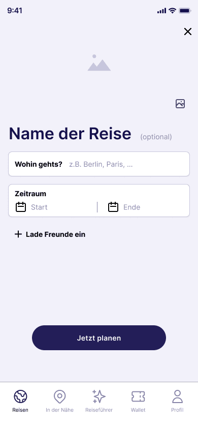
It should also be possible to organize trips together with other users. Everyone who has installed the app can view and edit the itinerary independently of each other, which can then be discussed at the appropriate time without having to organize a meeting first.
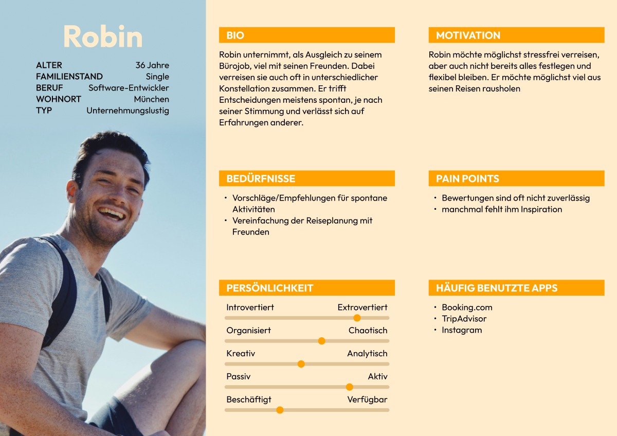
Who are my users?
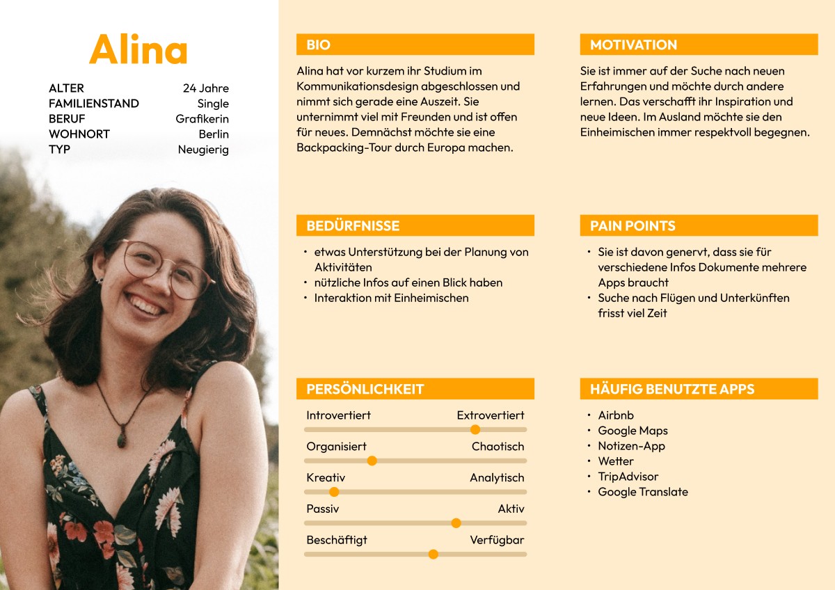
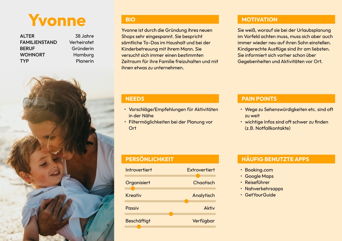
Based on the research findings, I created three personas that depict three types of travelers: Solo travelers, group travelers, and parents with children. During the subsequent development, I focused primarily on group travelers as they represent the largest target audience.
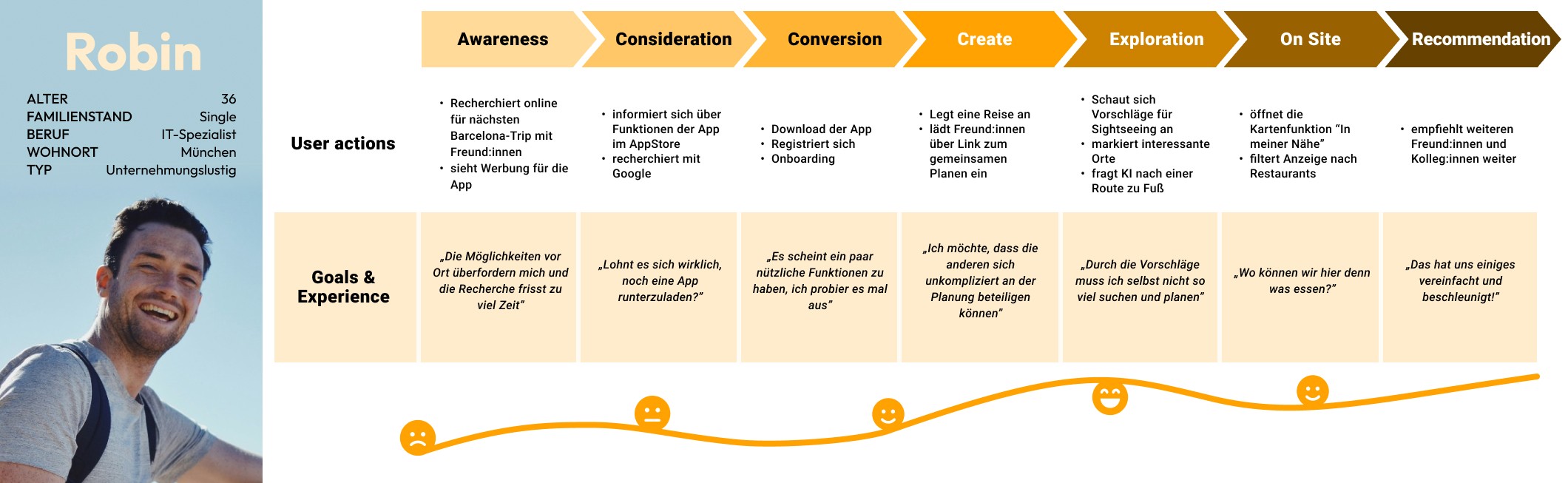
Using a user journey map, I visualized various touchpoints of the user with the app, which helped me better understand their needs.
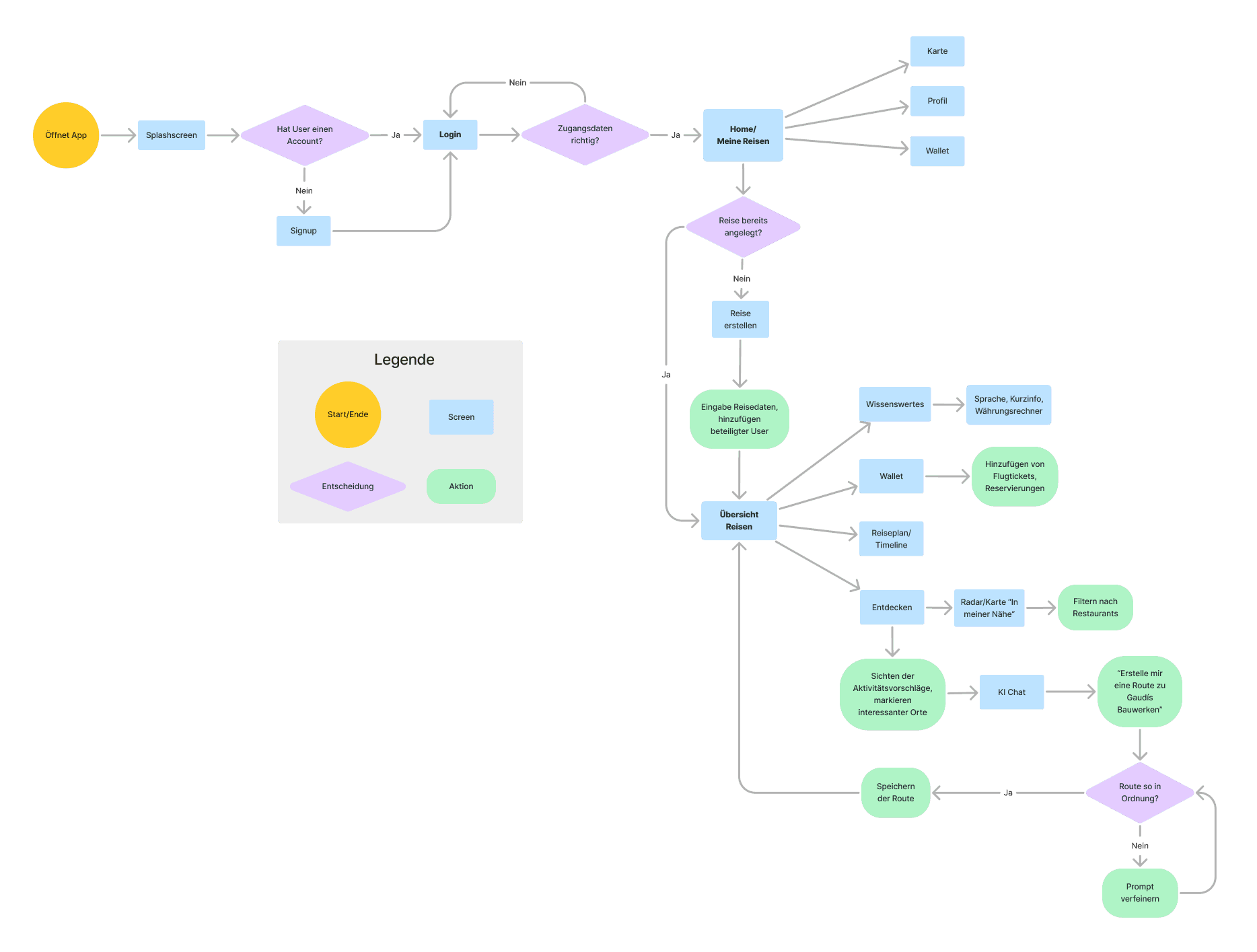
A user flow helped me to work out an initial structure for the app, group possible features and remove unnecessary intermediate steps.
Wireframes and Styling
During the subsequent wireframing, I was able to experiment with how individual screens should best be structured, which components are necessary for the final design and are repeated or what the optimal spacing between individual elements should be.
For the color scheme, I opted for two contrasting colors, with a muted purple conveying a calm and organized character and framing the content.
A vibrant orange, on the other hand, is intended to stand out and encourage the user to interact. It is mainly used for CTAs and as an accent color.
To ensure optimum legibility, I opted for the widely used Inter, which was specifically developed for displaying small to medium-sized text on displays. Thanks to its high x-height, the legibility is improved and the eyes don't tire as quickly when reading longer texts.
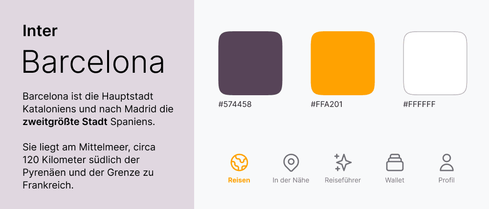
Stylesheet with a text example, the primary colors, and navigation icons
The final design
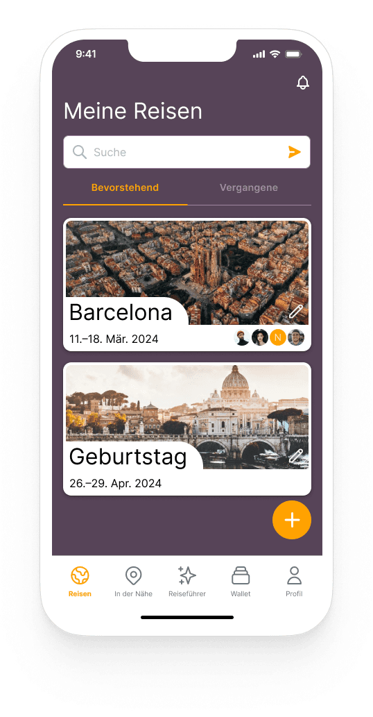
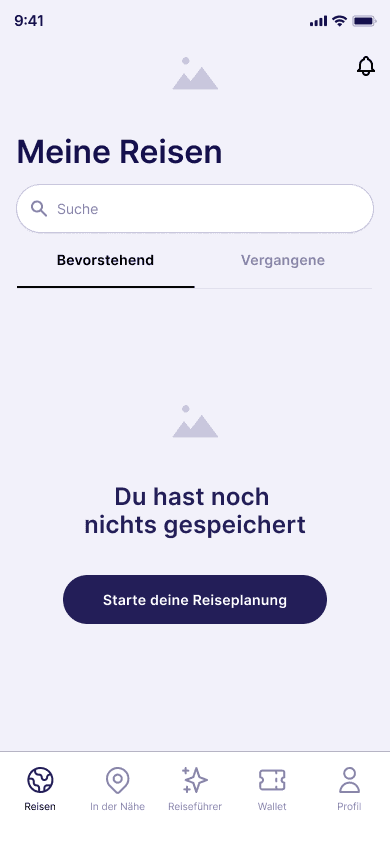
Overall, the user's attention is drawn to the essential points. Submenus are easy to grasp, content has been reduced to a few parts so that the user is not immediately confused by information and feels overwhelmed.
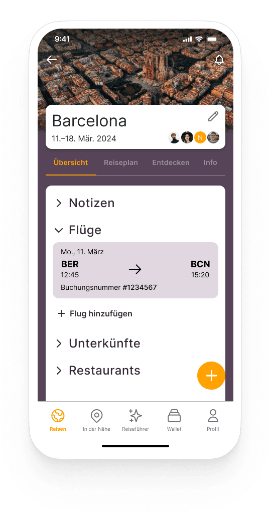
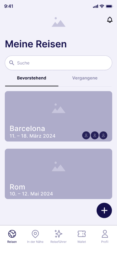
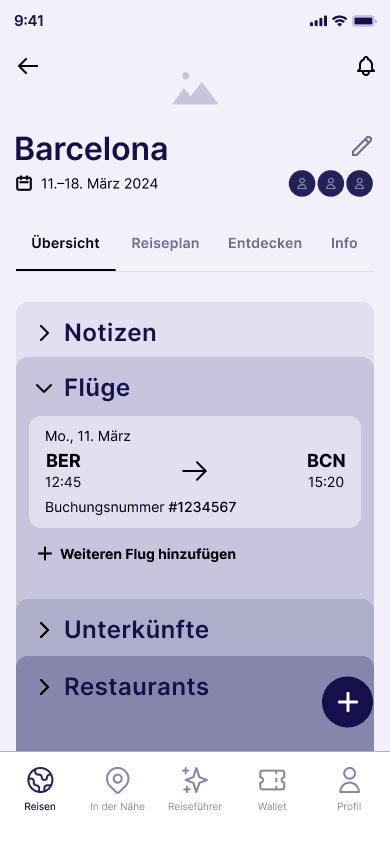
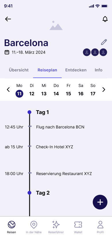
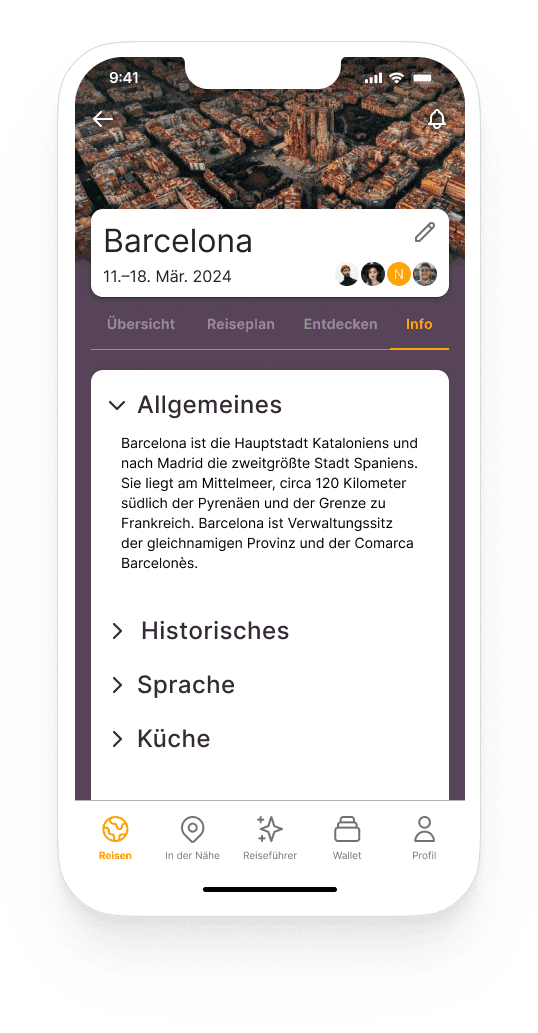
The header with the trip details, fellow travelers, and a photo matching the destination is always visible, so there is no confusion when switching back and forth between different trips.
Any user involved in planning can add or remove content independently of other participants. The other participants will then be notified of the change.
This allows everyone to take the time they have available and does not require a personal meeting to be organized.
In the bottom or main navigation, the key features of the app are located, which can be accessed from every screen.
Important bookings and reservations are listed on the overview page of the trip, which can be individually expanded with additional sections. Trip details and users involved can be viewed and edited in the header area.
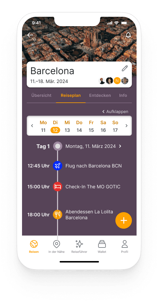
By using a tab navigation directly below, the user can navigate through individual menu items relating to the respective trip.
Under "Itinerary", there is a timeline on which various important points during the trip, such as table reservations or check-in times, are displayed as milestones. Data for this is either taken from the bookings entered in the overview or can be entered by the user independently.
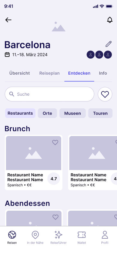
The "Discover" tab provides suggestions for various popular activities. These are divided into different categories, which can be selected using filters. The relevance of the suggestions is determined from an average of collected reviews from various rating portals. This way, the user receives a well-curated collection of various activities and places that can also be saved in a favorites list.
Under the "Info" tab, for example, general information or basic vocabulary in the local language can be looked up.
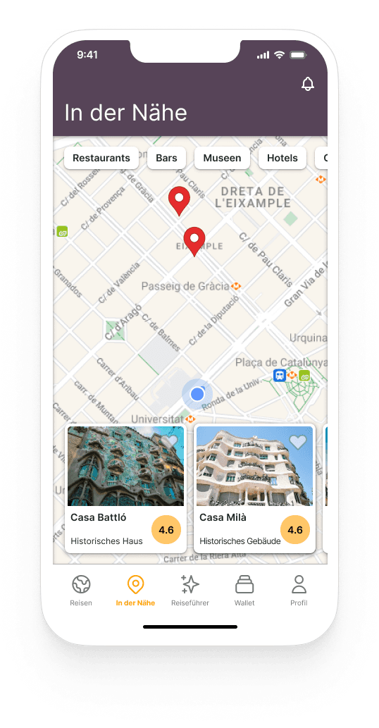
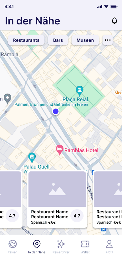
The main menu item "Nearby" takes the user to an interactive map in which various locations in the immediate vicinity of the user are listed as cards. These can be narrowed down as required using predefined filters.
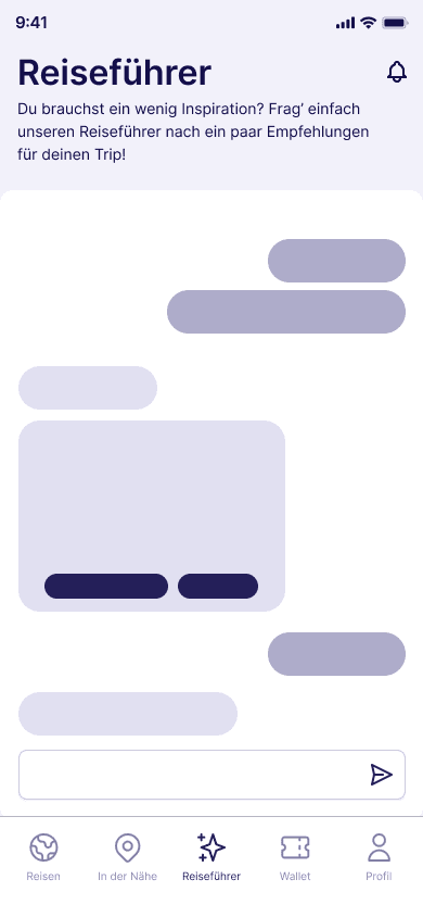
The AI assistant is referred to as "Guide". This opens a chat interface in which prompts can be entered. This allows users to ask for directions or recommendations, to which the guide immediately provides answers. If the responses are insufficient, the prompt can be refined repeatedly. Suggestions can then be saved.
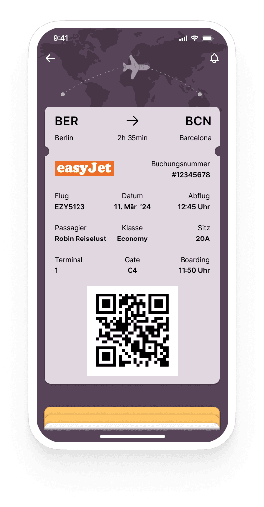
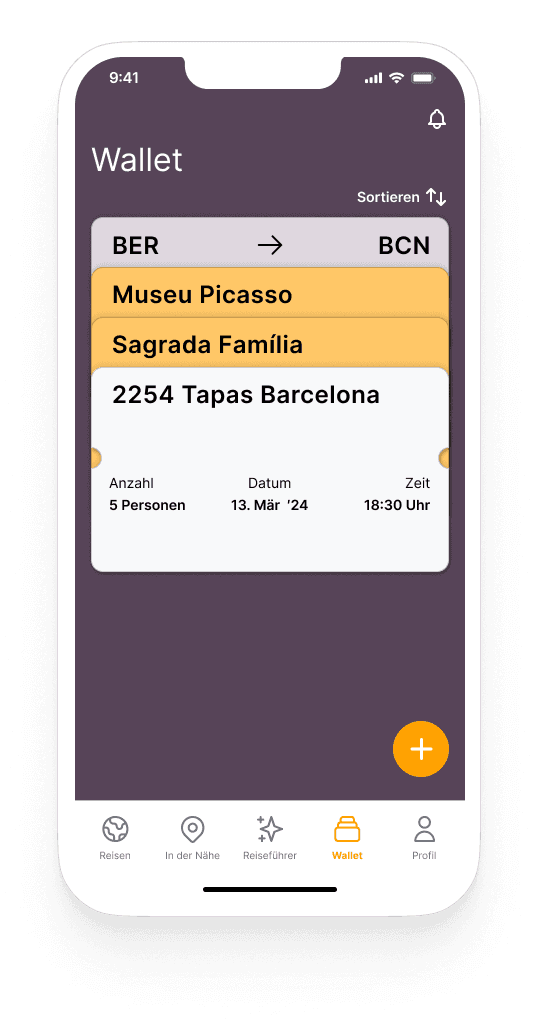
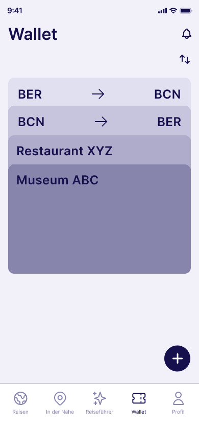
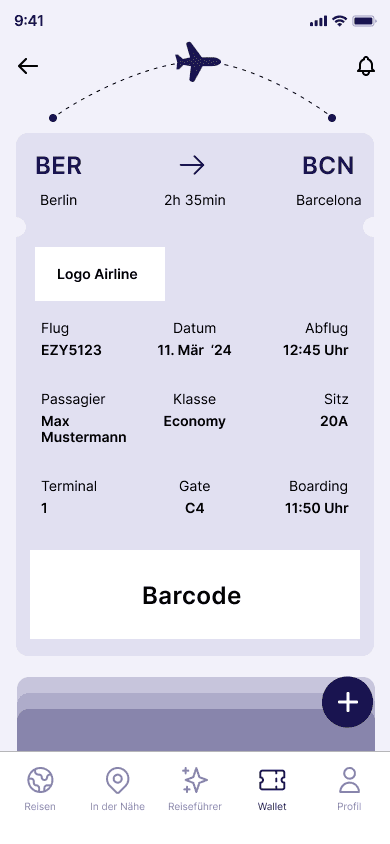
Flight bookings or tickets for museum tours, for example, are stored in the "Wallet". These are depicted as tickets and have a different color scheme depending on the category of the ticket. If a ticket is selected, it enlarges and reveals all relevant details.
More tickets can be added by using a FAB.
My Learnings
Even though it was challenging to develop an entire app on my own, I had a lot of fun preparing and designing it. During the four weeks of app development, I was able to successfully apply and deepen previously learned methods for user research and UI design.
The research phase made it clear to me once again how important it is to involve the user and their needs from the beginning in order to develop a meaningful and user-centered product.
Although I already had some ideas and features in mind in advance, I was able to prioritize and reduce them to the essentials thanks to the findings from the interviews.
As there wasn't enough time for meaningful testing, I would like to carry this out afterwards and optimize the app. For example, I would like to include a messaging function that allows a group to communicate easily within a created trip.